Livepeer is creating a scalable and decentralized PAAS for developers who want to add live or on-demand video to their project.
Epic Labs, a Software Innovation Center, specialized in the media industry, is contributing to the project, an effort funded by Livepeer’s grant program.
This is the first of a series of posts. The aim of these is to share with the community the progress of our research effort to gather feedback and ideas. Please share your comments and/or fork the repo to contribute. Let’s get to it!
As it is explained here:
Livepeer is a protocol for video transcoding. Transcoding is a compute-heavy process that has traditionally carried a high technical and monetary cost. Livepeer aims to slash the cost of transcoding with an open network that incentivizes transparent competition among suppliers of transcoding capacity. The rules of the Livepeer protocol are backed by smart contracts on the Ethereum blockchain, an immutable ledger.
The combination of an open, permissionless network and immutable non-reversibility attracts byzantine (adversarial) behavior: any participant can attempt to “break the protocol” without immediate consequences from within the Livepeer network. A verification mechanism is necessary to decide whether the transcoding work was done correctly.
Part of this contribution involves research and attempt to tackle the problem of verifying that the transcoded content itself is a reasonable match for the original source given a good-faith effort at transcoding.
Eventually, the mission consists on developing a verification classifier that will give a pass / fail output (and with what confidence score), for a given segment of a given asset.
Assessing the quality of a single asset
The literature on the topic of Video Quality Assessment (VQA) is quite vast and is out of the scope of this article to enter into deep details about it. Interested readers are referred to other Medium publications here (by Netflix) and here.
As a foundation to our discourse, let’s agree that when a transcoded copy of a video asset is made using lossy compression, there will be approximations and data omissions. The evaluation of the effect of those omissions by humans is termed Subjective Quality Assessment, and is based on the concept of Mean Opinion Score (MOS). However, these evaluations can be terribly tedious and time consuming, and isn’t progress about improving people’s lives?


Enter objective Objective Quality Methods. These methods, as their name implies, attempt to make a model of the distortions incurred during the encode /decode process and foresee the most likely MOS a piece of (lossy) compressed video will have. They can be either based on the Human Visual System (HVS) or on purely mathematical / engineering metrics, the latter being the most widespread kind of methods with a list of variations growing by the year: MSE, PSNR, SSIM, MS-SSIM, PEVQ, VMAF,…
Nevertheless, the aforementioned engineering / traditional metrics can still be categorized depending on whether they are based on a full comparison between the original and the transcoded version (FR metrics), on a comparison between a reduced representation of the original and the copy (RR metrics) or on a no-reference model that seeks artifacts and other degradations only in the copy (NR metrics).
For the purpose of this article and subsequents, we will abound on how to use these metrics to approve / reject a piece of encoded video.
A first experiment to build some intuition about the problem at hand is to depict the evolution in time of one of the metrics (say, SSIM) for a given movie. The charts below show the iteration frame by frame over the first 50 seconds (1240 frames) of Big Buck Bunny movie (720p@1.3Mbps), encoded to 500 kbps and 250 kbps, respectively.
As it would be expected, lower bitrate should introduce more artifacts and distortions, as can be seen from the fact that the 250 kbps curve goes almost parallel to the one for 500 kbps, just with slightly lower values, and in some specific scenes.

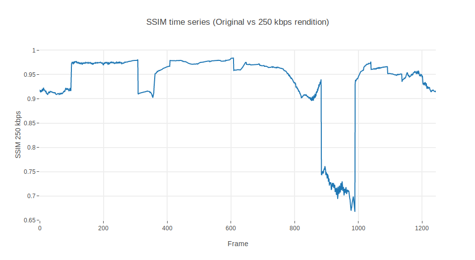
Well, this looks promising. Let’s see how much the SSIM diverges by measuring the ratio between one another:
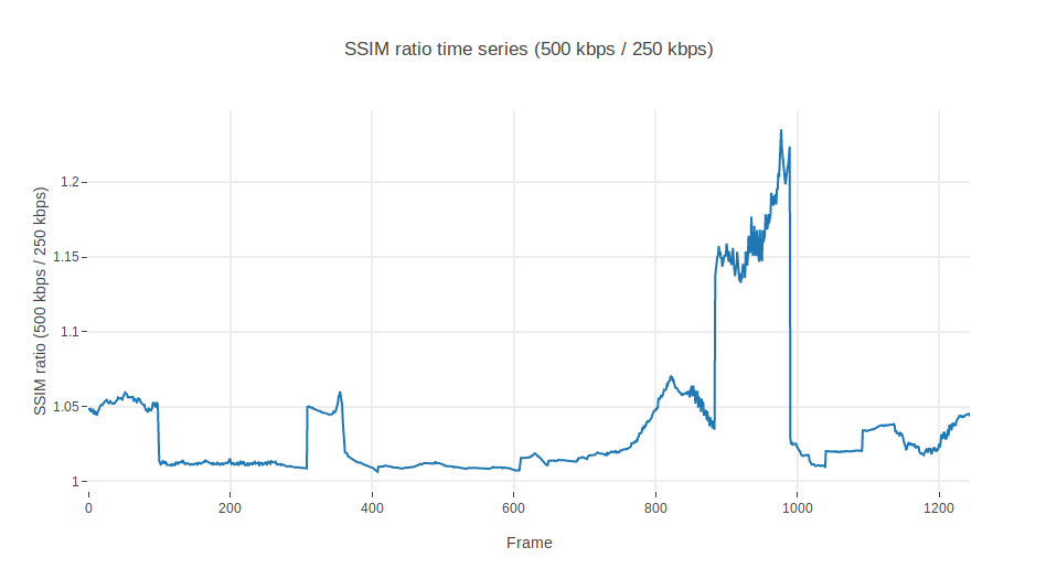
Aha, a mean ratio of 3%. One would expect a fairly flat line, not ramps and spikes, though. In future articles we may dig further on these glitches in the frames 95, 305, 405, 605, 880 and 986. Omit them for now if you can. Otherwise, this ratio could report to a fairly decent extent on how much distortion the 250 kbps rendition is contributing with respect to the 500 kbps.
Let’s see now what happens if, in a display of mischief, one includes a watermark in the 500 kbps rendition:

Ok, so the time series is now completely different. It would be very difficult to use SSIM to distinguish a lower bandwidth rendition from a watermarked rendition. The 250kbps rendition has a mean value of SSIM in 0.93 whereas the watermarked version shows a mean SSIM of 0.95.
Taking a look at the ratio between the 500 kbps and the watermarked rendition, we find something even more astonishing. Watermarks improve the SSIM!! (Well, in some segments at least).

Blast. Encodings with watermarks behave better than those with lower resolutions.

In practice, this basically means that if one were to use SSIM to establish a prescriptive threshold, this would be indeed arbitrary and subject to debate. Even if using statistical values like average, histograms or the like. Where is the limit? 1% ratio with respect to the mean? Too strict. 10%? Too loose.
Bringing in more metrics
Let’s use yet another metric, just to evaluate if this issue only affects SSIM. We summon PSNR, another VQA champion!
PSNR’s values have a scale different from SSIM . To begin with, they operate in dB (logarithmic), not linear scores. Nonetheless, some experts have defined tables that map dB to MOS. It is more or less accepted that below 20dB is the worst quality and more than 37dB is the highest one can perceive with the naked eye.
For our illustrative purposes, we will compare metrics as a ratio between renditions. Figures below represent the same experiment we did before: the ratio between the instantaneous SSIM of the 500 kbps rendition and the 250 kbps rendition and the same between the 500 kbps with watermark. SSIM and PSNR are superimposed to see their respective contributions.

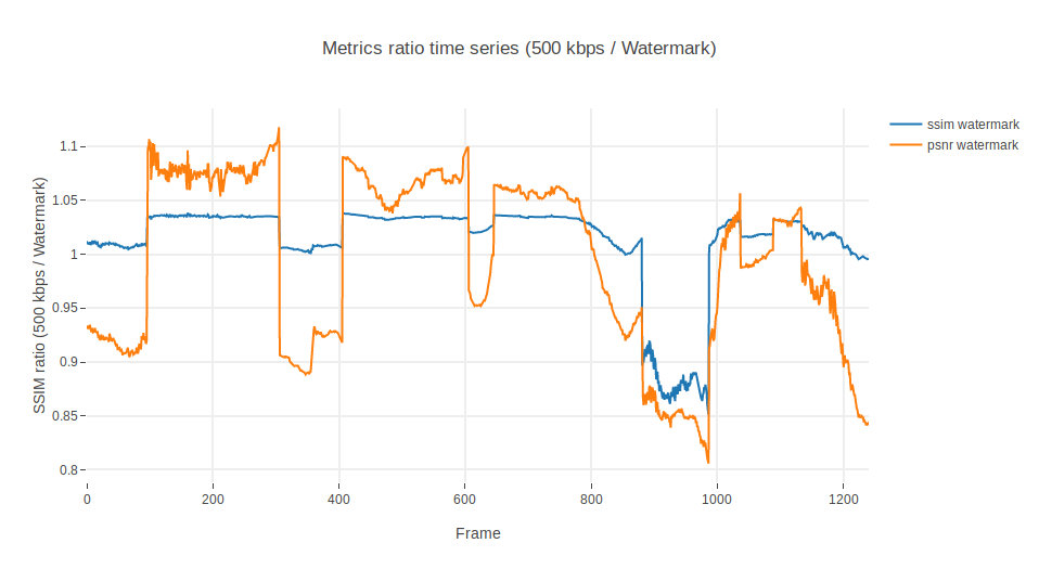
Ahm. Well. It seems that PSNR is not adding much more information. It is a bit more sensitive than SSIM to some scenes, amplifying the signal in both directions, but other than that, if we were to blindly use the average we would end up concluding again that watermarked renditions are better than those without (which is wrong).
Generalizing to several assets
But, let’s see to what extent we could still use them. Let’s leave watermarks aside. Perhaps there are upper and lower bounds to how much these metrics vary, and see if they can still be of any use to assess the validity of an encoding, if only to verify that an encoding is a decent copy of an original.
We have taken a number of assets from Youtube’s YT8M dataset and encoded a few renditions from there. Specifically, we have taken about 140 videos from this dataset, established the 1080p rendition as original, and encoded 10 seconds of each to 720p, 480p, 360p and 240p. For the sake of simplicity, we have reduced the respective bitrates to be equal to those used by YouTube for each rendition (you can find a more detailed article on how this can be done here).
We have also invited a few more full reference metrics to the party, namely cosine, euclidean and hamming distances, so we add more diversity to the analysis.
Once we have gathered our renditions, we have iterated video by video (4 renditions x 140 videos = 560 specimens) and extracted their mean PSNR, SSIM, MS-SSIM, VMAF, cosine, Hamming and euclidean hash distances with respect to the original 1080p rendition. Full details about this implementation can be explored in the github repo we have enabled here. Yet another caveat: the segments were chosen rather arbitrarily: 10 seconds (240 to 300 frames) from the middle of the video’s timeline. What if those segments happen to be non-representative of the whole video? They could depict a static scene with very low variation of colors, or otherwise fall in the middle of an epic battle with lots of motion. This is known to severely affect the output quality when bitrate is constant, hence the likelihood of an encoded job of being rejected even if properly done.
With this substantial amount of data, we can proceed to evaluate how different metrics relate to each other. A bit of EDA (Exploratory Data Analysis) might bring in some hindsight as to how metrics relate to each other. Matrix below depicts a pairs plot of our newly generated dataset. It builds on two elementary plots: scatter plots of one metric against each other and histograms of themselves in the diagonal. We can see that all distances (euclidean, cosine and Hamming) are linearly related, meaning basically that they could be used almost interchangeably. On the other hand, SSIM and PSNR are also somehow correlated in a logarithmic / exponential manner, but inversely with regards to the hash distance metrics. In a world apart, the more sophisticated MS-SSIM and VMAF present some degree of connection between them, and display a similar pattern as SSIM in their lower bound with regard to the hash distance metrics.
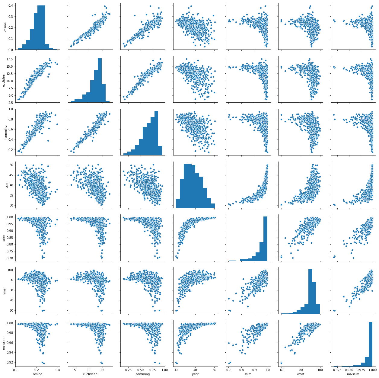
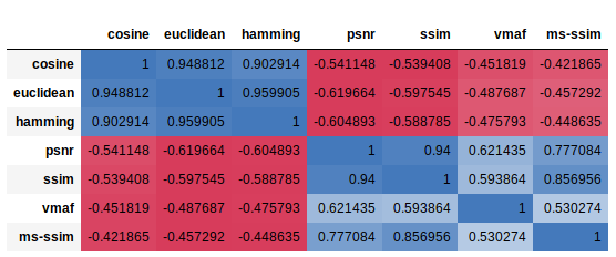
The intensity of this correlation is given by the Spearman’s correlation coefficient displayed in the table below. Without entering into details, let’s explain that Spearman’s correlation coefficient gives the same information as that of Pearson’s, but calculated on ranks instead of actual data values. This allows for identification of both positive (blue) and negative (red) correlations, where +1 means total positive correlation (when one feature grows, so does the other) and -1 means total negative correlation (when one feature grows, the other decreases).
From Wikipedia:
The sign of the Spearman correlation indicates the direction of association between X (the independent variable) and Y (the dependent variable). If Ytends to increase when X increases, the Spearman correlation coefficient is positive. If Y tends to decrease when X increases, the Spearman correlation coefficient is negative. A Spearman correlation of zero indicates that there is no tendency for Y to either increase or decrease when X increases. The Spearman correlation increases in magnitude as X and Y become closer to being perfect monotone functions of each other.
Summa sumarum, the above is basically telling us that to some extent all seven metrics would provide a fairly similar information once those relationships would be substantiated and disentangled by means of some mathematical sorcery.
On the other hand, one might want to see which metric has the lowest variance, hence giving a better approximation to the definition of strict thresholds. The histograms displayed in the diagonal of the pairs plot point MS-SSIM as the best candidate, with a lower bound somewhere in the 0.925 MS-SSIM points. There are some outliers, though, worth checking in order to further understand why they have such “bad” behavior.
In order to find out who are these outliers and why some assets present values of MS-SSIM below 0.975, we can plot the different metrics values against their rendition identifier. Each of the following charts displays the mean value of the respective metric for 10 seconds for all the different encodings we made. So, basically, for each asset we have four points. One for each rendition. Note that not all of them have a rendition in the 426:240, 640:360, 854:480, 1280:720, but doesn’t make them outliers. We are interested in the metric value, not the dimensions.


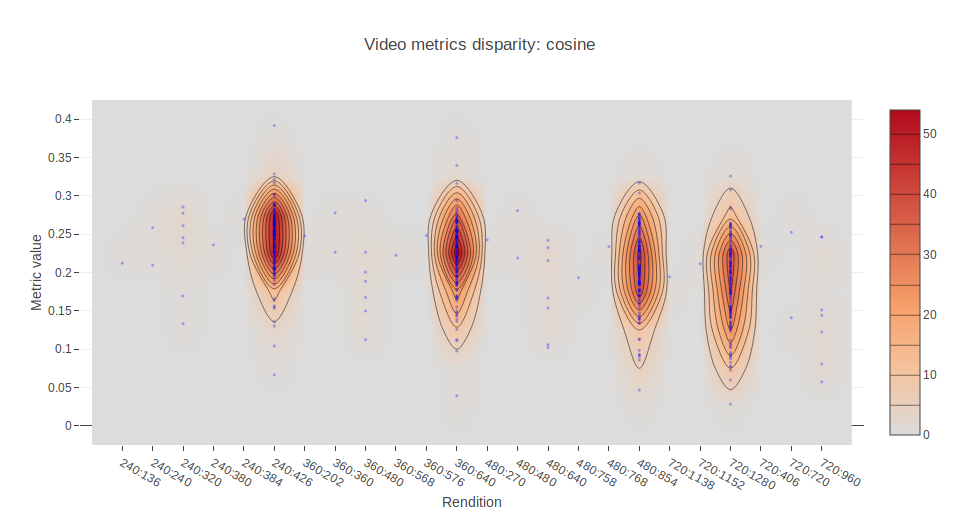
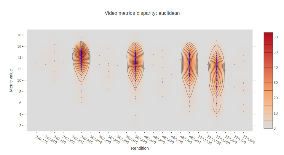
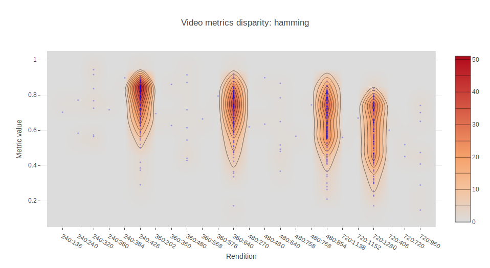
This allows us to locate outliers and inspect them further. In the Jupyter notebook provided in the repository, this can be easily done by means of Plotly and hovering the cursor over the points.

…and here we go. One frame of one of the samples that lie outside of the crowd is presented below. This video shows people jumping form the rocks into water and having their fun in what is seemingly a very complex asset, both in the dynamics through time as well as in the spatial relationships and pixel textures.

So, what does this mean? Only simple videos would pass a filter based on the average of a metric? We need to establish a somewhat more sophisticated metric that takes into account both the relative reduction in quality as well as the complexity in time and space.
Conclusions and further work
Ok, so. Objective Full Reference metrics alone cannot be used in isolation or grouped to define thresholds for acceptance / rejection. There are several problems associated with them.
In the first place, there seems to be provable that all of them supply the same or almost the same information (see the correlation table above) in one or another way.
Second, once we have agreed that we could establish a threshold under which measured distortion is not acceptable (for example, 0.97 MS-SSIM points), still other forms of attack are possible (i.e. watermarks).
Third, for complex videos the threshold might result too restrictive for acceptably well encoded renditions.
How do we proceed then?
One potential option is to tackle the problem from another angle, using No Reference metrics applied over both the original and the copy, then comparing. Another line of research would involve creating adaptive thresholds that would take into account the spatial and temporal activity levels of an asset. Yet another thread might lead us to simply create a neural network with annotated assets and define by ourselves different kinds of attack (poor resolution, watermark, etc).
This is getting interesting! Stay tuned for follow-up posts on this exciting research project!
References
About the authors
Rabindranath is PhD in Computational Physics by the UPC and AI researcher. Dionisio is Computer Science Engineer by the UPM specialized in Media. Ignacio is Telecommunications Engineer by the UPM specialized in Data Science and Machine Learning. They are part of Epic Labs, a software innovation center for Media and Blockchain technologies.
Livepeer is sponsoring this project with Epic Labs to research ways to evaluate the quality of video transcoding happening throughout the Livepeer network. This article series helps summarize our research progress.
To learn more about Epic, visit www.epiclabs.io or @epiclabs_io in Twitter.


